


CASE STUDY
From Canopy Partners to Mosaic Clinical Technologies
Designing the foundation for a new healthcare technology brand
How UX strategy shaped the evolution of Canopy Partners into Mosaic OS
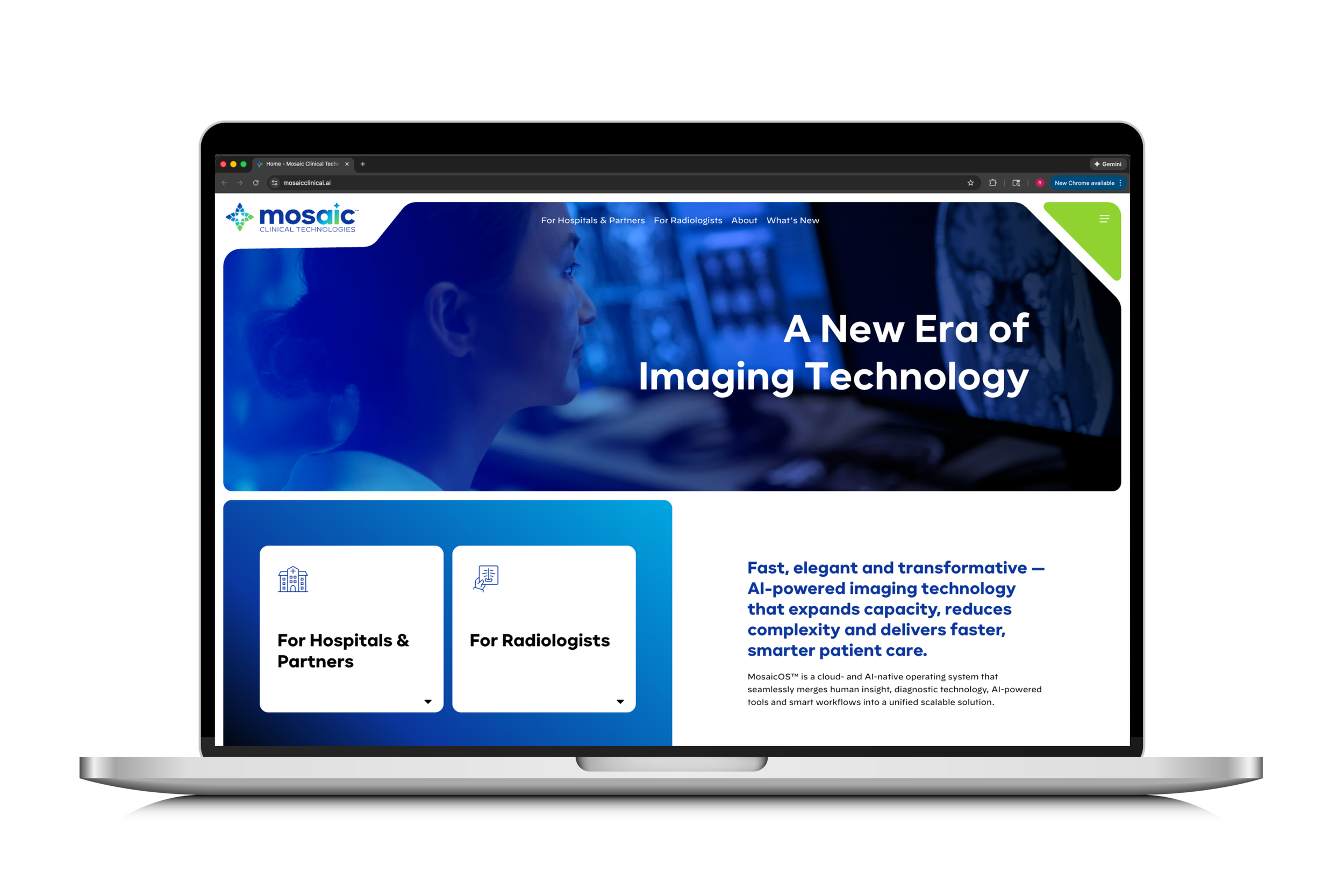
What began as a website redesign for Canopy Partners became the UX foundation for an entirely new healthcare AI brand: Mosaic OS.
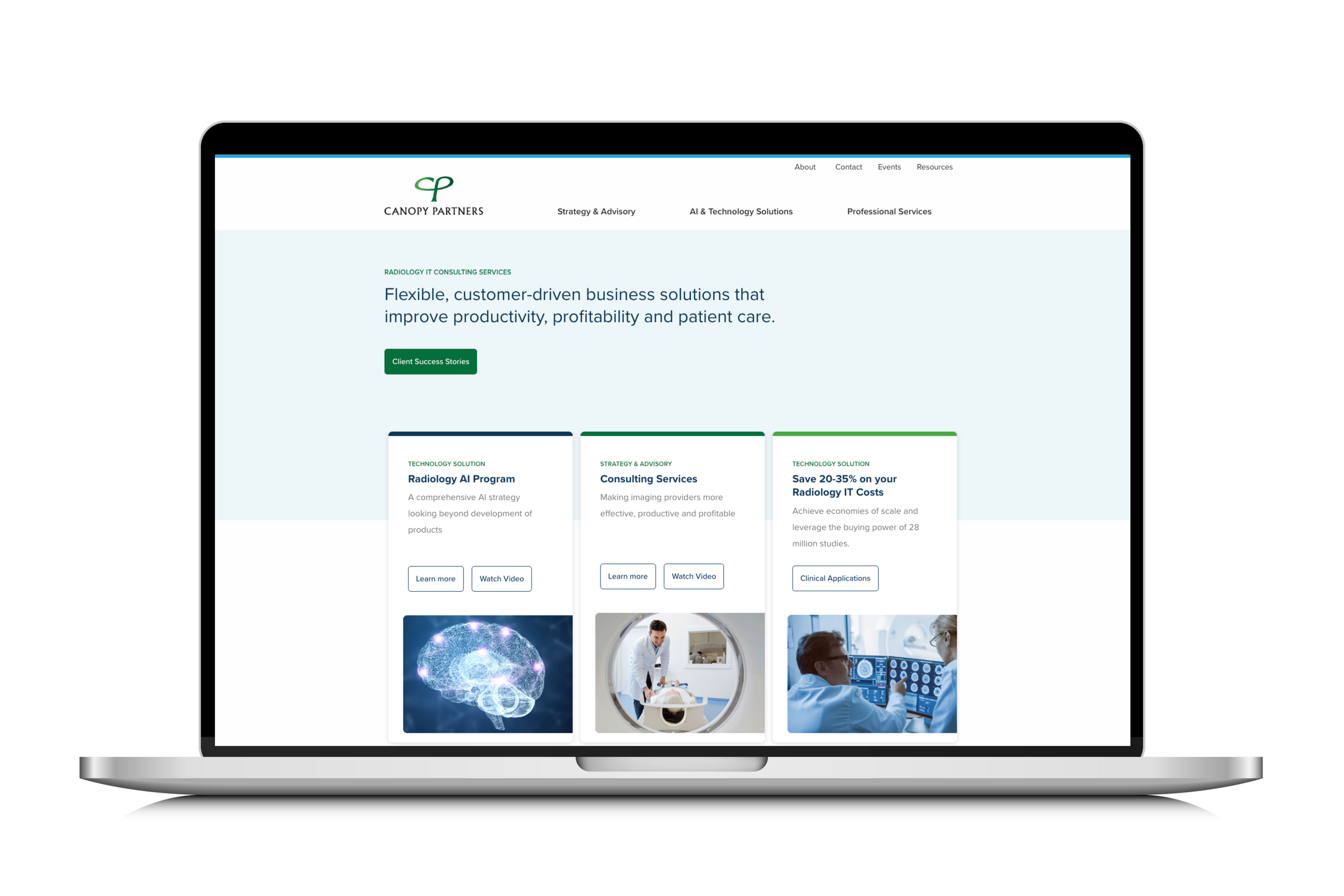
The original goal was straightforward — modernize the Canopy Partners website and improve clarity. But as research unfolded, it became clear the challenge was much larger. The product vision was expanding. The brand was evolving. The existing digital structure couldn’t support what the organization was becoming.
This project ultimately shifted from redesigning a website to architecting a scalable digital foundation for Mosaic OS.
The Challenge
Canopy Partners operated in a highly technical space — AI-driven medical imaging. The platform was powerful, but the digital experience struggled to:
Clearly communicate complex technology
Differentiate in a competitive AI healthcare market
Guide users confidently toward action
Scale alongside an evolving product vision
The problem wasn’t visual design. It was structure, clarity, and strategic positioning.
My Role
I led UX research and experience strategy across the redesign of Canopy Partners and the early evolution of Mosaic OS.
My contributions included:
Deep competitive and market analysis
Information architecture strategy
Wireframing and usability testing
Accessibility consultation (WCAG alignment)
UX consultation during Mosaic’s agency-led build
While an external agency executed the final Mosaic site build, I consulted on UX direction, architecture, layout decisions, and accessibility — ensuring the strategic foundation carried through.
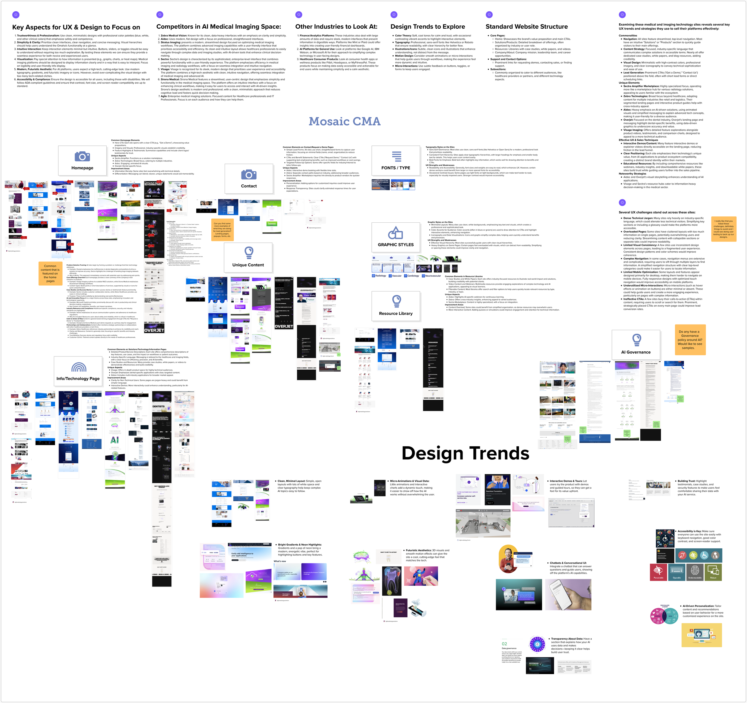
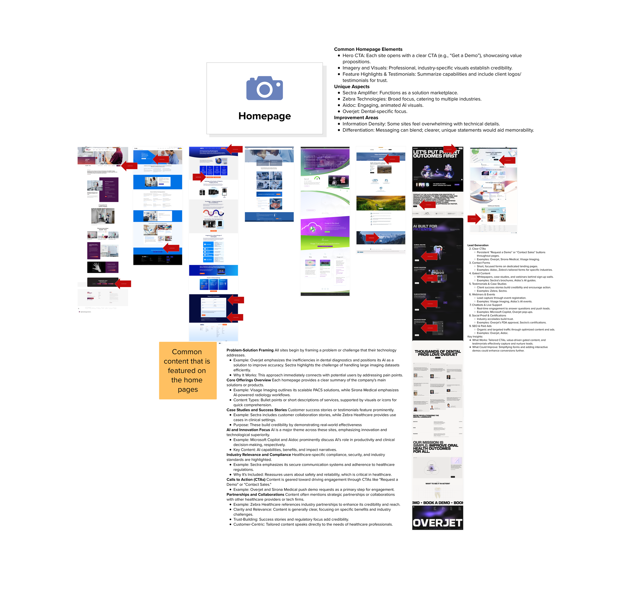
Phase 1: Research & Market Deep Dive
As scope expanded, I conducted a comprehensive competitive analysis across:
AI medical imaging competitors
Enterprise healthcare SaaS platforms
Adjacent industries explaining complex technology effectively
Emerging UX and design trends

Phase 1: Research & Market Deep Dive
As scope expanded, I conducted a comprehensive competitive analysis across:
AI medical imaging competitors
Enterprise healthcare SaaS platforms
Adjacent industries explaining complex technology effectively
Emerging UX and design trends

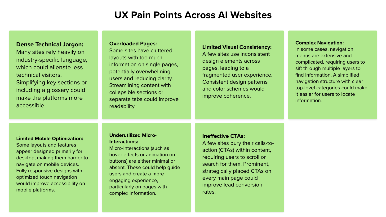
Challenges Faced:
Complexity: Canopy's existing platform suffered from complexity, making it difficult for users to navigate efficiently.
Inconsistent User Experience: Users encountered inconsistencies across different parts of the platform, leading to confusion and frustration.
Lack of Scalability: The platform lacked scalability to accommodate future growth and evolving user needs.


Our Approach:
User Research: We conducted in-depth user research to understand the needs, pain points, and behaviors of Canopy's target audience.
Iterative Design: Through an iterative design process, we created prototypes and gathered user feedback to refine the interface and optimize usability.
Scalable Solutions: Implementing scalable design principles ensured the platform could adapt to evolving requirements and accommodate future growth.
Proposed Site Map

Wireframes designed by the Digital Experience Team


Usability Testing
As the sole UX designer, I led usability testing with the goals of verifying navigation ease, understanding user perceptions, and establishing expectations. Our test included open questions, prototype tests, and opinion scales to uncover user needs.
Results revealed click-ability issues and the necessity to expand certain click zones. However, after users learned clickable elements, misclick rate decreased from 67.7% to 16.7%, and direct navigation success increased from 81.8% to 100%.


Results
Streamlined User Experience: Our redesign significantly improved the platform's usability, resulting in smoother navigation and increased user satisfaction. Tasks that previously took multiple steps were now accomplished more efficiently, leading to a more positive user experience.
Consistency Across Platforms: By establishing design patterns and guidelines, we ensured a consistent user experience across all parts of the platform. This consistency not only improved usability but also strengthened the brand identity of Canopy Partners.
Scalability for Growth: The new design is scalable, allowing Canopy Partners to seamlessly integrate new features and adapt to changing industry trends. This flexibility ensures that the platform can grow alongside the company and continue to meet the needs of its users.


Cost-Savings:
Through our collaborative efforts with Canopy Partners, we were able to achieve significant cost savings. By redesigning and transitioning the website in-house, Canopy Partners avoided outsourcing costs and gained greater control over the development process. This resulted in approximately $120,000 in cost savings, which could be redirected towards other strategic initiatives within the organization.
Conclusion:
Our collaboration with Canopy Partners led to a transformative redesign of their digital platform, enhancing user experience, ensuring consistency across platforms, and achieving substantial cost savings. This project not only improved the functionality of the platform but also positioned Canopy Partners for continued growth and success in the healthcare technology sector.